New Members: Be sure to confirm your email address by clicking on the link that was sent to your email inbox. You will not be able to post messages until you click that link.
Did the Post-Crash Bull End In August?
driver49
✭
I'm going to post two charts here that I recently drew with Stockcharts "Annotation" feature.
The first shows the duration of the entire bull market from March '09 through about a week ago.
What concerns me is the trend line that draws from the March 09 low through the late summer '11 lows. Extending that trend line into 2015, it was clearly broken with the break in August. Subsequent action brought a lower high that peaked just below the extended trend line, and then a series of lower highs before the break in January (which appears to have been contained on the downside by the August/October lows.
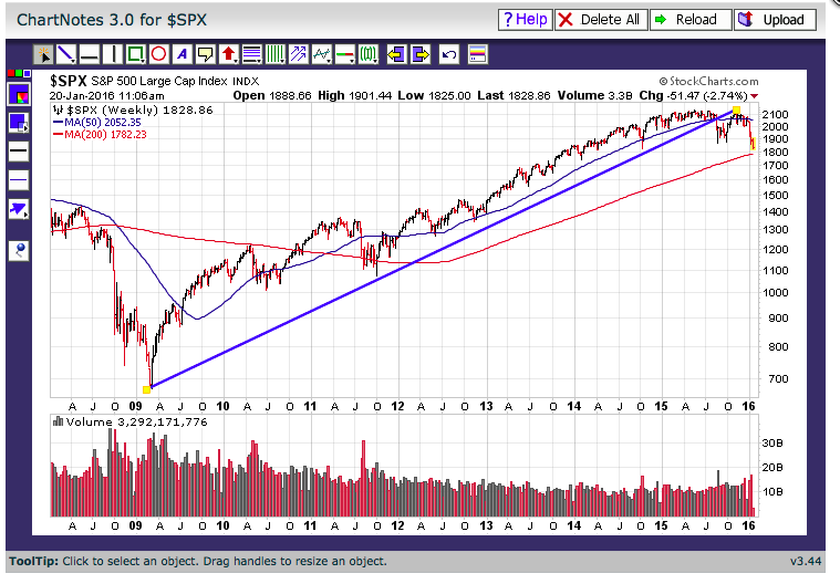
I realize that this is a simplified analysis, but it sure looks to me like the sort of thing that one might look back on with the benefit of 20/20 hindsight and say, "yup, that was a top, and that was break, and that was the end of that long-term (but perhaps not secular) trend.
As if to underscore that assessment, here's another chart that shows the major action since 1996. That includes the top/bear market in 2000-01 and the top/bear market in 2007-09. I haven't drawn a trend line for the 200o top, but look at the line/break in 2007. It looks (disturbingly?) similar to the break and bounce we recovered last year. And you see what happened after that...
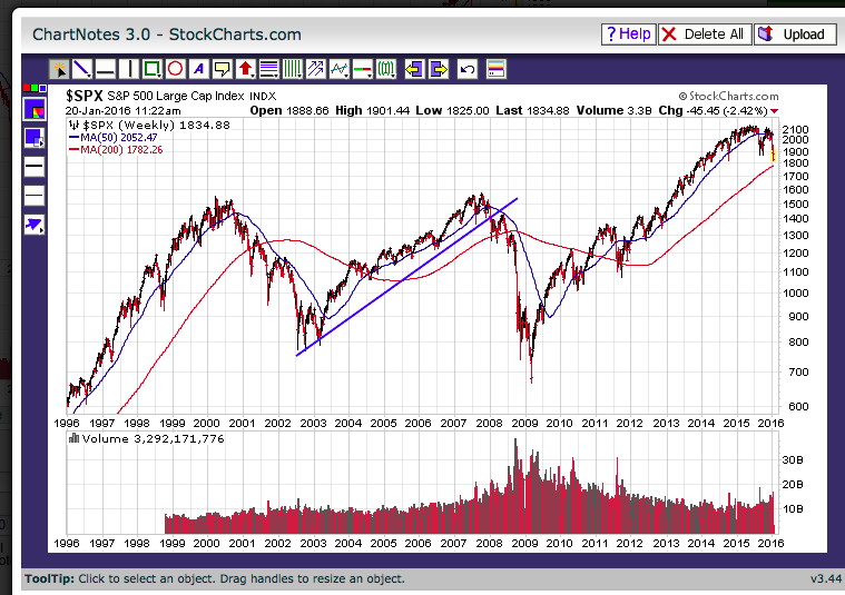
I've got another chart somewhere that draws a horizontal line across the 2000/2007 tops, which suggests to me that a reasonable expectation is a return to/test of that "broken-resistance-becomes-support" level, perhaps before a continuation of a secular bull after a period of retraction and, who knows, maybe a somewhat over due recession.
There's probably an argument to be made as well for the cycles we see here... it was about 6 years from the first top to the second, and it's now been 6+ years since the second...
I just wonder if anybody else sees these patterns, or if there are other indicators that might be used to confirm or challenge this thesis.
Thanks in advance for any input or feedback.
My handle is driver49, my name is Paul.
--PS
The first shows the duration of the entire bull market from March '09 through about a week ago.
What concerns me is the trend line that draws from the March 09 low through the late summer '11 lows. Extending that trend line into 2015, it was clearly broken with the break in August. Subsequent action brought a lower high that peaked just below the extended trend line, and then a series of lower highs before the break in January (which appears to have been contained on the downside by the August/October lows.

I realize that this is a simplified analysis, but it sure looks to me like the sort of thing that one might look back on with the benefit of 20/20 hindsight and say, "yup, that was a top, and that was break, and that was the end of that long-term (but perhaps not secular) trend.
As if to underscore that assessment, here's another chart that shows the major action since 1996. That includes the top/bear market in 2000-01 and the top/bear market in 2007-09. I haven't drawn a trend line for the 200o top, but look at the line/break in 2007. It looks (disturbingly?) similar to the break and bounce we recovered last year. And you see what happened after that...

I've got another chart somewhere that draws a horizontal line across the 2000/2007 tops, which suggests to me that a reasonable expectation is a return to/test of that "broken-resistance-becomes-support" level, perhaps before a continuation of a secular bull after a period of retraction and, who knows, maybe a somewhat over due recession.
There's probably an argument to be made as well for the cycles we see here... it was about 6 years from the first top to the second, and it's now been 6+ years since the second...
I just wonder if anybody else sees these patterns, or if there are other indicators that might be used to confirm or challenge this thesis.
Thanks in advance for any input or feedback.
My handle is driver49, my name is Paul.
--PS
0
Comments
-
Interesting observations, Paul. Thanks for contributing.
A couple of comments. A problem with trend lines is there are no rules for drawing them. Without rules, you have to be wary of selective perception. That said, I think in the current market, no matter how you draw it, a major trend line has been broken.
The question is, then what? If you draw intermediate trend lines on the current advance, or prior advances, you can see that the major trend can be broken a number of times without triggering a catastrophically cascading market. Why should this time be different? Well, there's also no reason it couldn't be a disaster. We'll just have to see.
I think right now there are not technical grounds for calling a bear market. We don't have a clear lower high and lower low that Dow theory calls for (on the other hand Dow signals can be very late). There's also an argument for a range from here. The two dips into the low to mid 1800s by the SP (circled on the chart below) both brought out huge supporting volume, suggesting that area could be floor. On the other hand, higher prices through most of 2015 did not attract new volume, so a break to the upside doesn't seem to be in the cards either.
If this is not a range, fib lines (no real rules for those either, but...) for the recent leg suggest convergence around the 1575-1625 area, where there is also potential support from the 2007 high.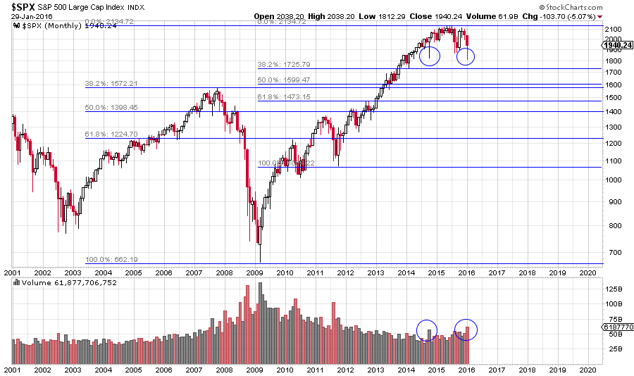
0 -
P.S. another note on trend lines: if you put a long term SP500 chart on a non-log scale chart, the 2009-2011 trend line hasn't been broken. Which scale is "valid"?

0 -
Paul and Mark, interesting observations from both of you. I think this is dialogue worth continuing in this Market Analysis section of S.C.A.N. Thanks.0
-
I agree, trend line analysis can be very subjective and prone to "confirmation bias." Thanks for the input here... and, yeah, the floor in the 1800s seems confirmed for now. Thanks for adding the volume component. A trading range... seems entirely plausible at least fora while.
Re: your non-log version of the 2009-11 trend line... I wonder, what does it look like if a similar non-log line is drawn under the 2001-2007 bull market? Obviously that line got crossed at some point....0 -
@markd
With respect to trend lines on linear vs log scale charts.
I prefer to use log scale on long term charts and this is certainly a long term chart. I also look at the price range between the low and the high, in this case it is over 200%, I would suggest anything over 10-20% range should use log scale.
The problem is with a linear or arithmetic scale, (on a chart with significant low high diff), a straight trend line, is a line of diminishing returns. On a linear chart a constant rate of return (or percent change) is an exponential curved trend line.
Here's a link to an article I wrote on this subject years ago which explains it in much more detail, with charts and examples. Let me know if you agree.
http://scan.stockcharts.com/discussion/comment/850/#Comment_850
Here's one of the examples;
0 -
@driver49 , welcome aboard, interesting topic.
I can't predict what answer is right or wrong but will offer you a few comments to consider.
With respect to trend lines, I agree with Markd there are a little subjective to the bias of the line drawer. First two points do not make a trend line, you've got more than that, I like at least 3-4 and more if the trend is over a long period of time.
I also tend to look at long term trend lines as a band rather than a single thin line. I believe Arthur Hill also promotes this method, its an "area" of support or resistance, not an exact point.
Another problem with long term trend lines on the $SPX is you are not really looking at all 500 stocks in the S&P. The index is market cap weighted, so the top 10% of the stocks swing a 50% weight in the index and its movement. However there is a solution, try your analysis using the $SPXEW, this is an equal weight index.
One last thing to consider the $SPX is an index so it doesn't include any adjustments for dividends. Over a long term chart these can also affect the chart, have a look at the $SPXTR, this symbol is "total return" and includes the dividends. I don't think there is a symbol for the equal weight total return of the $SPX.
Also see my other comments on linear vs log scaling.
cheers0 -
@gord I agree logarithmic charts have their uses and you have clearly explained the differences and the reasoning behind them. My main objection to them is they show ancient history very clearly, but compress recent action sometimes to the point of near invisibility.
With respect to trend lines, I question how long the lifetime of a trend line can really be. It seems to me a trend line can be valid only if it CLOSELY follows the price action (in the appropriate time frame). Also, it seems to me that the usefulness of old prices must decay over time as fewer and fewer players continue to hold positions initiated at those old prices. More recent prices should be more relevant.
I've seen so many arbitrarily drawn trend lines (where price wanders off for extended periods before coming back somewhere near the supposed trend), that I settled on these rules of thumb (which are not pure Wyckoff but probably owe something to him). They are:
A rising trend line (the "demand" line) is drawn between two points - the low that initiates a new leg up, and the low of the reaction to the leg up. Those two points express the comparative ability of buyers and sellers to move price, and the line is drawn based on the assumption is that that relationship will persist (until it doesn't).
A parallel line (the "supply" line) is extended from the highest high between the two lows.
The resulting channel is valid until one of the lines is broken. A break of the demand line is made by a HIGH below that line (not just a close or low). A break of the supply line is a LOW above that line.
When a line is broken, a new channel is constructed from two more recent points that best express the comparative strength of buyers and sellers (one of them may be the second point of the first channel, but the first point cannot be re-used). Again, the points chosen should be based on a price impulse and the immediately adjacent reaction to it. You may have to wait for them to appear if price action did not create them prior to the break.
A falling trend channel would be constructed similarly, but connecting two highs.
The advantages of the rules of thumb are: it makes it harder to draw lines that aren't there and it forces you to look more often and more closely at the price action, which makes it easier to see when things are changing.0 -
Here's an arbitrary example of the rules of thumb applied to an individual equity.

0
Categories
- All Categories
- 2.4K StockCharts
- 397 SharpCharts
- 146 Other Charting Tools
- 69 Saved Charts and ChartLists
- 1.5K Scanning
- 74 Data Issues
- 177 Other StockCharts Questions
- 218 Technical Analysis
- 155 Using Technical Analysis
- 2 InterMarket and International
- 19 Market and Breadth Indicators
- 42 Market Analysis
- 109 Trading
- 109 Trading Strategies
- 163 S.C.A.N the StockCharts Answer Network forum
- 65 Using this StockCharts Answer Network forum
- 98 s.c.a.n. archives
- 5 Off-Topic
- 6 The Cogitation & Rumination Emporium
- Forum Test Area

