New Members: Be sure to confirm your email address by clicking on the link that was sent to your email inbox. You will not be able to post messages until you click that link.
Wyckoff in the news

markd
mod
This story was in the news lately (Nasdaq MarketBeat) :
" The long-running mystery around Warren Buffett’s latest stealth investment is finally over. In Berkshire Hathaway’s (NYSE: BRK.B) newest 13F filing, the Oracle of Omaha revealed a fresh stake in UnitedHealth Group Incorporated (NYSE: UNH). Berkshire ended Q2 holding five million shares, valued at about $1.6 billion, a position it likely began building quietly in the prior quarter after requesting permission from regulators to accumulate shares without triggering a rush of buying....David Tepper picked up 2.27 million shares, while Renaissance Technologies added 1.35 million shares... "
Here's a chart of UNH showing its (simplified) Wyckoff characteristics:
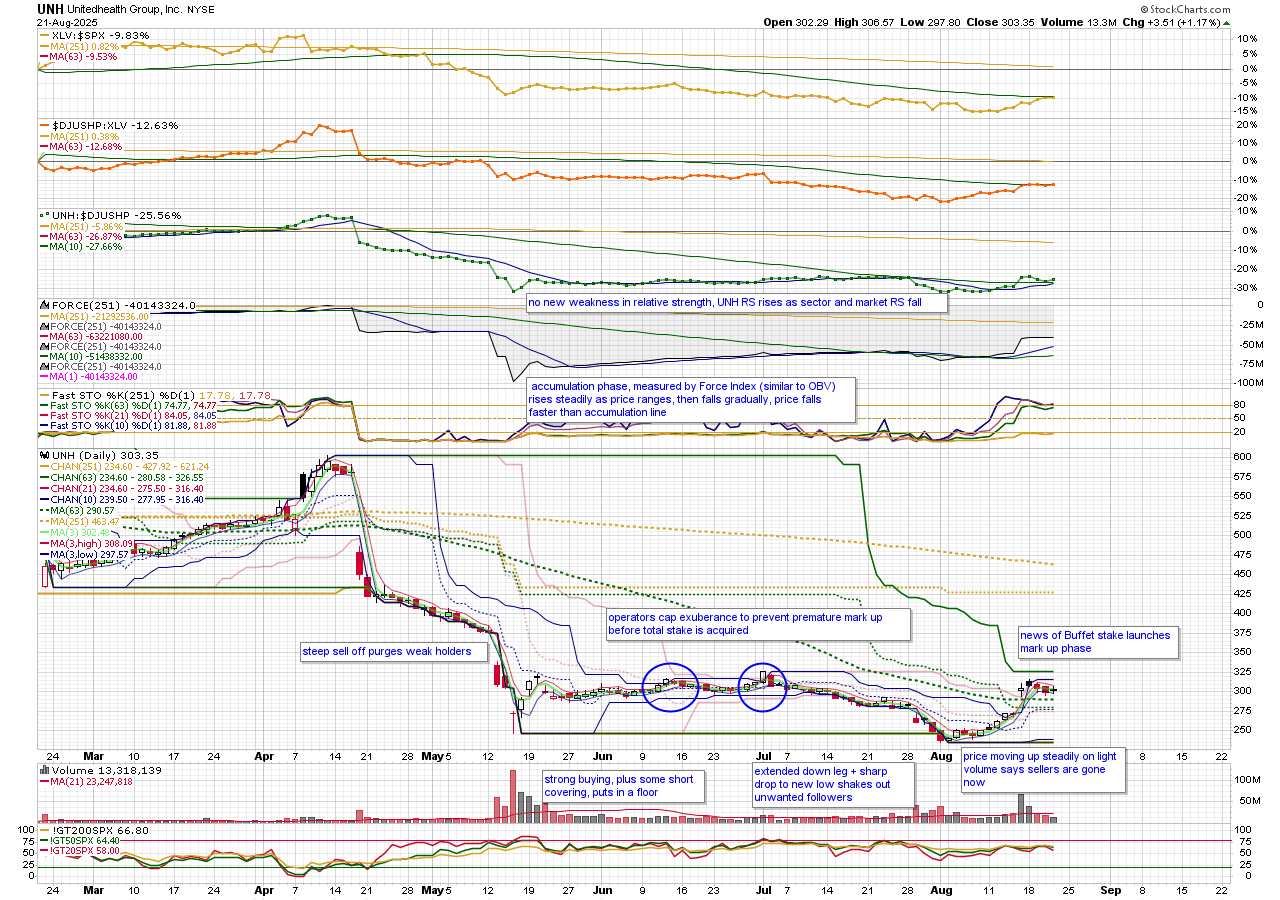
The essence of Wyckoff is that knowledgeable big money accumulates a big stake in a sold out but promising stock without raising the price too much. They first let the stock come to them from discouraged late sellers. Then they begin to actively buy, raising the price as little as possible. If they attract a following, they discourage it by strategically shorting what they have bought until the short term oriented outsiders get discouraged and leave. Once they have their stake, and the followers are gone, they begin the mark up by advertising the stock with a few days of buying, which with no more sellers after the followers are gone, runs up easily. Then the good news comes along ( in this case, its just that Buffet bought) and the stock is on its way.
You don't really need to know all the technical aspects of the Wyckoff method. The essence shows up in the Force indicator moving mostly up faster while price is flat or down more than Force. It works best when price hangs out in a range above its most recent low, while Force rises. Then things go quiet, or the price low gets tested, and then price breaks out.
Not every operation works. Even the smart money can be wrong.
p.s.
UNH seems to be progressing in the mark up stage after a period of consolidation following the last post.
" The long-running mystery around Warren Buffett’s latest stealth investment is finally over. In Berkshire Hathaway’s (NYSE: BRK.B) newest 13F filing, the Oracle of Omaha revealed a fresh stake in UnitedHealth Group Incorporated (NYSE: UNH). Berkshire ended Q2 holding five million shares, valued at about $1.6 billion, a position it likely began building quietly in the prior quarter after requesting permission from regulators to accumulate shares without triggering a rush of buying....David Tepper picked up 2.27 million shares, while Renaissance Technologies added 1.35 million shares... "
Here's a chart of UNH showing its (simplified) Wyckoff characteristics:
The essence of Wyckoff is that knowledgeable big money accumulates a big stake in a sold out but promising stock without raising the price too much. They first let the stock come to them from discouraged late sellers. Then they begin to actively buy, raising the price as little as possible. If they attract a following, they discourage it by strategically shorting what they have bought until the short term oriented outsiders get discouraged and leave. Once they have their stake, and the followers are gone, they begin the mark up by advertising the stock with a few days of buying, which with no more sellers after the followers are gone, runs up easily. Then the good news comes along ( in this case, its just that Buffet bought) and the stock is on its way.
You don't really need to know all the technical aspects of the Wyckoff method. The essence shows up in the Force indicator moving mostly up faster while price is flat or down more than Force. It works best when price hangs out in a range above its most recent low, while Force rises. Then things go quiet, or the price low gets tested, and then price breaks out.
Not every operation works. Even the smart money can be wrong.
p.s.
UNH seems to be progressing in the mark up stage after a period of consolidation following the last post.
0
Comments
-
Thanks Mark. Nice chart.0
-
Dec 2024 UNH CEO assassinated
March 2025 Court rules that Government failed to prove its $2 billion on Medicare Advantage Overbilling civil case.
April 2025 UNH cuts earnings forecasts based on unexpected higher medical usage costs.
May 2025 CEO resigns and UNH withdraws all forecasts. WSJ reports that Government has criminal investigation for Medicare Advantage Overbilling.
Aug 2025 announces plans to cut several unprofitable UNH Medicare Advantage plans effecting 600k seniors. Berkshire Hathaway discloses $1.6 billion position taken in the second quarter of 2025.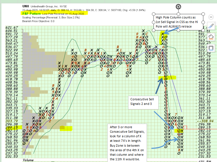
0 -
@lmkwin Excellent.
What I wanted to bring out for possible Wyckoff doubters, who might argue that his thinking is outdated, is that the market still operates today much as it did then, and Buffett and UNH is a documentable example.
If there is an advantage to the Wyckoff approach over others, it might be that you can get a bargain entry when the 'operators' are shaking out the followers who don't recognize that an operation is in play. But that does require some conviction.0 -
I agree @markd. First you get investing knowledge (reading or watching). Then experience (observing and practice and more observing and practice) . Then skill (you can "see" what you need to see and know what you should do with the information). Once you learn an investing skill, it's yours to keep.
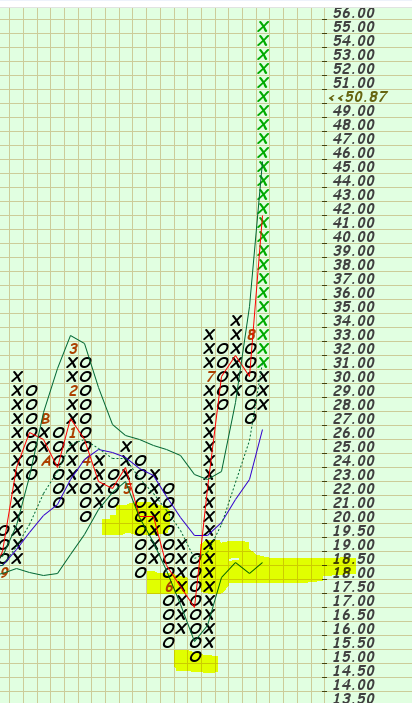
On that PnF chart, the Month Markers are the numbers and letters on the chart. 1=Jan, 9=Sep, A,B,C are Oct,Nov,Dec.
I should have mentioned the Volume by Price indicator as well. It shows the price levels and trading volume at those price levels. Longer VbP bars are where the higher amount of volume occured. You can also use the setting Color Volume and it will show "buying volume" and "selling volume" as different colors within the Volume by Price bars. I ticked a yellow highlight on the 289.15 box where the highest "buying volume" showed on that indicator. Volume by Price is an excellent indicator to add to your charts.
Wyckoff Distribution if often marked by Consecutive Sell Signals.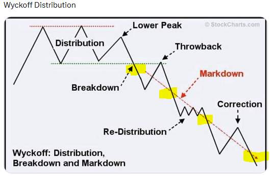
0 -
@lmkwin
So, scanning for the Wyckoff accumulation pattern with conventional overlays and indicators is hit and miss because the accumulation period can vary from a few weeks to a few months. You get a lot of 'false' hits and miss what would have been 'good' hits.
Have you tried P&F scans specifically for Wyckoff set ups? Or would it be a matter of scanning for 7 x's and examining the chart for the sell signals?0 -
I do have several, what I call "foundation" scans, that look for Stages that are more aligned with Weinstein than Wyckoff. The principles are the same. Look for extended weakness and distribution followed by signs of strength or accumulation. I do use 7 and 8 and 9xx scans as well.
As with most scans, you can tighten them up to where you may be excluding what you really should be looking at. Scanning on patterns and sequence is extremely difficult. So I tend to widen up my scan net and then review the names that best match up with what I'm looking for. CandleGlance View makes quick reviews and discarding names very easy.
One of my favorite PnF patterns is the Low Pole pattern. I often have cautioned about High Pole columns, Low Poles are the opposite of that equation. I separate my descriptions of PnF into Columns and Patterns. A High or Low Pole Column is one that exceeds the prior column by 4 or more boxes. This is the long leg column that stands alone on the chart for a bit.
Then the column will retrace, usually forming a High Pole or Low Pole Pattern. So Patterns and Columns are two different things to remember when I talk PnF. Column lengths are momentum. Shorter columns are momentum easing, Longer columns are momentum increasing.
Low Pole columns may be long bottom wicks. They may be continued unrelenting selling or they may be climactic. I prefer the last or the 2nd to last Sell Signal in a CSS to be the longest columns of O in the CSS. This usually indicates seller exhaustion. The 7xx is a sign of accumulation. The 7xx may be news related, short covering, or a sign that buyers have entered the name.
Columns of 3, 4 and 5 are pretty common. A normal trend is based on those lengths. 5 up and a smaller number reversal is required to stay above a Traditional Trend Line on a PnF chart. Columns of 6 and higher are less common. Of couse, depending on the price of the name, those numbers may need to be adjusted. This is why I suggest that one should also review the PnF chart using the Percentage scale. I usually use a 3x2.5 or 3 x 3. This will create a more standardized view of the chart. The UNH chart was a 3 x 2.5%.
I'm working on a "new" scan to add to my group of "foundation" scans, to identify the distribution turning to accumulation. This one uses the weekly ROC(1) looking for Min and Max in proximity, with Max occuring AFTER Min. Min is largest down ROC and Max is largest Up ROC for the Min/Max period. ROC uses Close vs prior Close.
You may notice in the graphic below that larger candles and their proximity to each other. Longer candles are reflected in ATR. Tops and bottoms are often where volatility increases. Large ROC1 changes can often point out where the "hidden" volatility signals are occuring. Close changes vs Range changes. May have more to share on that scan/thought process after more intent study. "Intent" means using other market time periods to study whether the information is useful or just interesting. Preliminary results point to useful. 0
0 -
A few things to chew on there. Thanks!0
-
thanks for the kind words.
I do have a question. This morning SATS (Echostar) jumped 25 points on news. The first half of the charts has a sell off that would attract a Wyckoffian, but there is no classic accumulation phase (price and Force stay in sync instead of going out of sync). Instead, prices spike and drop with news.
My question is, does the P&F chart show the three sells and 7x s you detailed above (not necessarily just before today; but what about the June move), or do the more irregular price movements you get with news driven stocks mess up the normal patterns?
p.s. - how do you get to P&F charts on the new workbench. I had to go back to Classic to find it.0 -
A few comments. SATS shows a classic Dynamic CSS Pattern on its PnF chart. The 2nd to last PnF Sell Signal contained the longest column of Os, followed by a column of X at least 7X's high. On a stock below $20, I use a 6xx as the percentage movment is very high under 20 on the traditional scale.
You are correct, that the classic Wyckoff accumulation doesn't appear in the current activity, the potential Wyckoff bottoming started in late 23 early 24 perhaps. The large recent moves are gaps and gaps are problematic in most things I look at. It had a large gap in June (where the 6xx column appears and a large gap today. I don't care for gaps much, unless I'm long pre-gap. Then I LOVE gaps.
On the New SharpCharts Workbench, I've been working with Support to try and modify certain behaviors there. As you may know, I am still a Classic SharpCharts guy and probably will be for a while.
One thing that I use A LOT is going into a chart from ChartList View and modifying the chart and then Applying to All to get that chartstyle into the chartlist. Then I would click on the View All link at the top of the Classic Workbench to go back to the Chartlist View. On the New workbench you would need to click on the View As dropdown and then select Chartlist View. This would open a new tab with your Chartlist View, leaving the New Workbench as an open tab on your browser.
They made the change so that now, when you click on the view as dropdown and select ChartList it uses the SAME tab.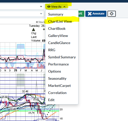
The whole additional tabs thing is annoying to me, so getting rid of one instance is good in my opinion. I run scans. It opens a tab with the results. I click back to the scan and change something (date or syntax) run it and it opens another tab. Click back and make another change and it opens another tab. I haven't figured a logical way around that but on the Classic it didn't make all the tabs. I'm warming to the New Workbench though.
As far as where other chartstyles are on the New Workbench, you need to click on the More button. Options there include my favorite PnF chart as well as other popular choices like ACP and others.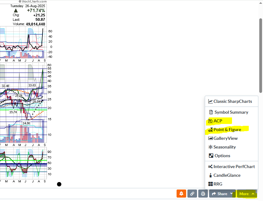
I'm warming up to the New Workbench as I like the ability to see the Symbol Summary in the same panel. Their changing the opening new tabs on the issue that I presented also removes another obstacle to my moving to New by default. As of now I'm still default Classic until I have all my issues worked out or they close off the access. I'm still not a fan of the size difference and the trashcan, but the more I use it the more comfortable I am.
0 -
UNH seems to be progressing in the mark up stage after a period of consolidation following the last post.
Check out the edited first entry at top of page.0


Categories
- All Categories
- 2.4K StockCharts
- 397 SharpCharts
- 146 Other Charting Tools
- 69 Saved Charts and ChartLists
- 1.5K Scanning
- 74 Data Issues
- 177 Other StockCharts Questions
- 218 Technical Analysis
- 155 Using Technical Analysis
- 2 InterMarket and International
- 19 Market and Breadth Indicators
- 42 Market Analysis
- 109 Trading
- 109 Trading Strategies
- 162 S.C.A.N the StockCharts Answer Network forum
- 64 Using this StockCharts Answer Network forum
- 98 s.c.a.n. archives
- 5 Off-Topic
- 6 The Cogitation & Rumination Emporium
- Forum Test Area