Point and Figure Price Objective

The link below describes how they are calculated.
https://chartschool.stockcharts.com/table-of-contents/chart-analysis/point-and-figure-charts/p-and-f-price-objectives/p-and-f-price-objectives-vertical-counts
https://chartschool.stockcharts.com/table-of-contents/chart-analysis/point-and-figure-charts/p-and-f-price-objectives/p-and-f-price-objectives-breakout-and-reversal-method
The Price Objective will display on the PnF chart if you select the Price Objective type you'd like to use.
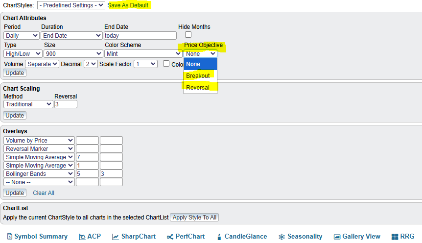
Once you get your PnF chart settings where you want them, click on the Save As Default and every time you use a PnF chart, your settings will be saved. Your default PnF chart will also be used in the Gallery View listing.
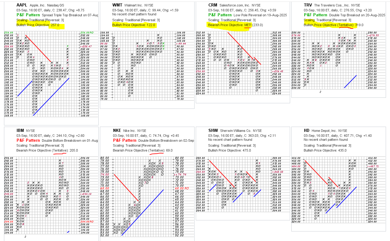
Price Objectives are simple math applied to the momentum (column length of the original breakout) to arrive at a value that will display on the PnF chart. You may see a PO with a number and the word Tentative next to it. This means that the PO column has not "completed", by reversing columns, so the PO could change with each additional box filled on that column, therefore tentative . You may see a PO with a number and the word Met next to it. This means that the chart has already equalled or exceeded the initial PO value.
You can also see the Price Objectives using the PnF charts in CandleGlance view. This can be a fun view to quickly see securities that have 'met' current Price Objectives and those that haven't yet.
Comments
-
From Grok (interpreting Stockcharts) How to Identify the Count Column Step-by-Step
Look for the breakout pattern (decisive move out of a pattern)
For upside targets: Find the column of Xs that pushed above resistance (double-top, triple-top, etc.).
For downside targets: Find the column of Os that broke support (double-bottom, triple-bottom, etc.).
Confirm with a reversal :Wait for a 3-box reversal into the opposite symbol (e.g., from Xs to Os).
This reversal “locks in” the count column’s height so you can measure it.
Count the boxes in that column
That number = the raw count.
Example: If the breakout column had 7 Xs, the count is 7.
Apply the formula
Count × Box Size × Reversal Amount = Extension.
For a 1×3 chart (most common): 7 × 1 × 3 = 21.
Add (for bullish) or subtract (for bearish) this extension from the breakout level.0 -
You can visually do the Price Objective extension from the significant columns.
Bearish PO, take the O column length and add that length of O's to that column of O's. Basically Bearish PO is O column times 2.
Bullish PO, take the X column length and multilply by 3. So you add 2 lengths of X to the X column.
I've been studying ways to get this value into scans and alerts. The PO value isn't something that StockCharts has available for scans, so I've been looking at options that are available to use.
The PO is fun to be aware, particularly the Bearish PO, as it might help you stay in position longer, or look to initiate a position coming off the PO.
COST, for example, has been in a very long term uptrend since 2010. It has met a Bearish PO or two in the run, but none have broken that long term uptrend.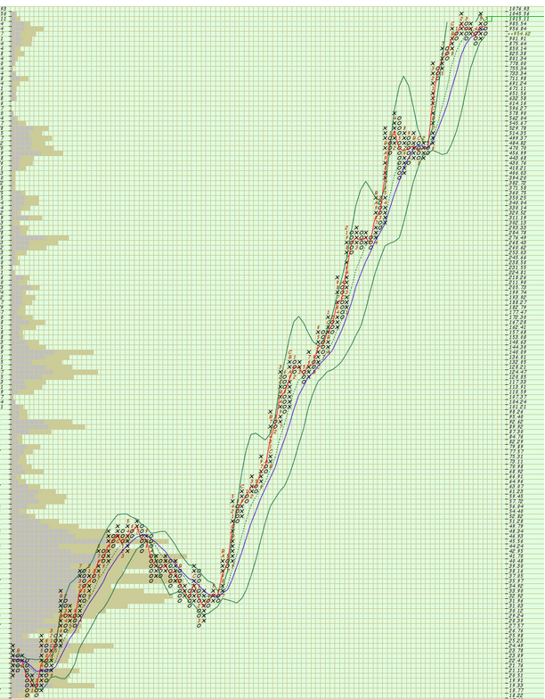
3x3% reversal chart. 2003-2025. 2008-09 is the drawdow that met a Bearish PO Oct. '08. Hasn't met one since on this scale.
A few years after I became more PnF centric, I learned about the CSS Strategy for Point and Figure Charts, and studied it intently. It is a set of patterns. One of the Patterns used the DOM, or Downside Objective Met. A CSS that meets the Bearish PO and then reversed back up within a few boxes.
The Dynamic CSS Pattern that I espouse is an offshoot of the CSS Strategy. I don't use the DOM part at the moment, but am always looking for ways to enhance or improve on my system. I can share more on my PO work if interested. It's still a work in process, but then isn't everything I do?
0 -
From your experience, how would you assess the reliability of the price objectives?
By reliability I guess I mean, how often does price reach the price objective before going back below (or above, if short) the signal entry, such that you would get stopped out?
Also, as I recall from my Wyckoff related P&F work (some years ago now), some stocks do meet their objectives, but it might take a year, or two or three. Any indications from the P&F chart that that might be the case?
Does reliability vary with the type of stock? e.g. institutional versus small caps or non-institutional mid caps?
Thanks for sharing!0 -
I don't think anyone has a published study on Price Objectives as they are a very transitory value. A "sell signal" today will create a new bearish PO. Yesterday's bullish PO is no longer displayed. It's still there in essence, it's just no longer displayed on the chart. I mentioned about manually or visually applying them as an optional skill to develop.
Price Objectives is just a name, as are Buy and Sell Signals. It is math applied to the initial momentum (column length) of the 1st signal given in a direction. A long column gives a larger PO and a shorter column gives a lesser PO value. Don't think of them as a magnet, but as an indication of potential.
Some PO's are improbable. You may note some securities have a Bearish PO of 0.00. I'd say that 99.99% will not meet that PO. Tom Dorsey suggests that they should be used to help determine the Risk/Reward value. That's what they use on Nasdaq Dorsey Wright. Traditional scale with PO used for RR.
Jeremy DuPlessis extends PO's from all longer columns. His software only uses % trend PnF charts. He looks for clusters of PO's for a view of probable potential. That is really all PO's are, potential.
Price Objectives obtained from using a % trend chart are more consistent and usually more conservative compared to traditional scaling, but StockCharts.com has, let's call them inconsistencies, with PO on the % trend charts.
I look for the ability to meet a PO. If a stock hasn't met a Bullish PO, that is a consideration for analysis. If, like COST, it hasn't reliably hit a Bearish PO, that is also a consideration for analysis.
I believe that Wyckoff used the Horizontal Count method. StockCharts and NDW use a Vertical Count method. The Horizontal Count uses a period of consolidation / congestion. Think of Triple Tops or Triple Bottoms, or Spread Triple Tops or Bottoms. Price reversals that can be viewed as a Price Channel. The more columns created, means more width, means larger values and more potential.
Horizontal Counts are probably more "reliable", but most likely can take longer to meet or not. I know that Bruce Fraser uses the Horizontal Count and it's remarkable how often they are met in his market analysis.
https://chartschool.stockcharts.com/table-of-contents/chart-analysis/point-and-figure-charts/p-and-f-price-objectives/p-and-f-price-objectives-horizontal-counts
Vertical Price Objectives appear relatively frequently on a chart as a simple Buy or Sell Signal is needed to create it. Horizontal Price Objectives are a bit more rare as a period of consolidation/ congestion is needed. Vertical Price Objectives are based on one column. Horizontal Price Objectives are based on many columns.
Just my opinion. Hope this helps?
In ChartSchool, StockCharts gives an example of a Consolidation scan:
[type = stock]
and [today's close > today's SMA(50,close)]
and [today's max(5, Aroon Up(20)) < 50]
and [today's max(5, Aroon Down(20)) < 50]
and [today's max(5, Plus DI(20)) < 30]
and [today's min(5, Minus DI(20)) < 30]
and [today's Slope(20) < .3]
and [today's Slope(20) > -.3]
https://help.stockcharts.com/scanning-and-alerts/scan-writing-resource-center/scanning-case-studies/scanning-for-consolidation-and-breakouts
But there are many ways to look for consolidation/ congestion.
0 -
Thanks. Much appreciated.0
-
Dorsey Wright PnF University, who I consider the authority on PnF says the following:
Vertical Price Objective and Horizontal Price Objective.
This technique is used when evaluating the risk/reward ratio of a stock. It is imperative that you evaluate the risk/reward ratio when investing. This topic is discussed several times in the book "Point and Figure Charting 3rd Edition." Price objectives are NOT set in stone, but are a good guideline in determining how far a signal can carry a stock. There are two types of counts; the Vertical Price Objective and Horizontal Price Objective. With each type you can determine a bullish and bearish price objective. Each are described below.
The Vertical Price Objective.
You will hear people ask "What is the PO?" - meaning, "What is the Price Objective?". Typically we use the Vertical count when evaluating price objectives. We prefer to use the Horizontal count when a stock has built a large base. This is how they are calculated.
For the Bullish Vertical Count:
Look to the column that has the first buy signal off the bottom and count the number of X's in it. You wait for the reversal down into a column of O's before counting the number of X's up to ensure there will be no more X's added to the column.
Once you have counted the X's, multiply by 3 (for the three box reversal method) and then multiply that product by the value per box.
Add this result to the bottom X
0 -
In the 7xx public chartlist, what does DCP mean? Like in 0020 EPAC.
0 -
Thanks for checking out that chartlist. I've been trying to add chart notes when I can. Annotations aren't available on PnF charts, but StockCharts support told me about a way to put some context into the charts. DCP is an abbreviation I sometimes use for a "Dynamic CSS Pattern".
I've discussed the Dynamic CSS Pattern many times on this board. You can put Dynamic CSS Pattern in the Search at the top of the forum for some prior posts discussing the concepts. Link below was one that had a bunch of interesting discussion on a gamut of topics.
https://scan.stockcharts.com/discussion/comment/7295#Comment_7295?utm_source=community-search&utm_medium=organic-search&utm_term=dynamic+CSS+pattern
On the EPAC chart, the 3 Consecutive Sell Signals, followed by a column of X, at least 7X's long. Because the price of the bottom X of the 7xx column of EPAC was less than $20, I suggest dropping down to a 6xx column requirement.
 0
0


Categories
- All Categories
- 2.3K StockCharts
- 395 SharpCharts
- 146 Other Charting Tools
- 69 Saved Charts and ChartLists
- 1.5K Scanning
- 74 Data Issues
- 177 Other StockCharts Questions
- 218 Technical Analysis
- 155 Using Technical Analysis
- 2 InterMarket and International
- 19 Market and Breadth Indicators
- 42 Market Analysis
- 109 Trading
- 109 Trading Strategies
- 163 S.C.A.N the StockCharts Answer Network forum
- 65 Using this StockCharts Answer Network forum
- 98 s.c.a.n. archives
- 5 Off-Topic
- 6 The Cogitation & Rumination Emporium
- Forum Test Area