New Members: Be sure to confirm your email address by clicking on the link that was sent to your email inbox. You will not be able to post messages until you click that link.
Color chart.

simcoe
✭
in SharpCharts
How do you have a solid color on a chart below the price line?
0
Best Answer
-
So you want this on the Price indicator only, not the main chart?
Here are the settings that do that on the example link you supplied above - Area under Style and purple under Color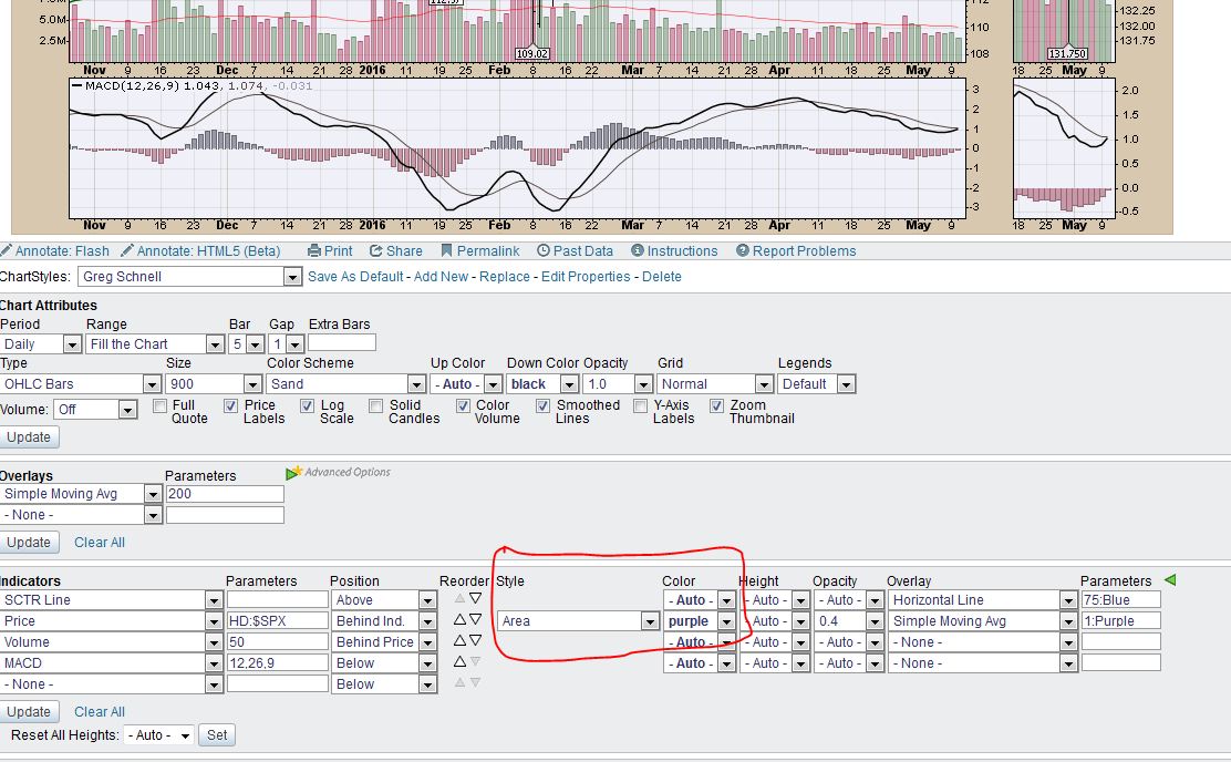
You have to have the subscription level that gives you advanced options.
0

Answers
-
I think what you want is:
On the Chart Workbench
Under Chart Attributes
Click on the drop down "Type"
Select "Area"
Then, if you want, you can customize the color under Color Scheme - Custom.0 -
When I do the above procedure it changes the color of the whole chart, not just the area below the price line which is all I want.0
-
Maybe someone else knows another way.
"Up Color" seems to modify the area under the line. But it also modifies the volume indicator color for up bars as well. Don't know a way around that.0 -
My first thoughts were along the line of Markd's suggestion.
If you can post a link to a chart or an article which shows the type of chart you are looking for, we can probably figure it out.0 -
http://stockcharts.com/h-sc/ui?s=HD&id=p8&def=N&listNum=1 This link shows a solid color below the price in the top indicator panel which is what I would like to accomplish, Thanks.0
-
Like this?
https://stockcharts.com/h-sc/ui?s=IBM&p=D&b=5&g=0&id=p91203665019
This is an area chart (select from Type drop down under Chart Attributes) with Up Color set to pink.0 -
I still am not able to have the chart with a solid color from the price line down as in the chart displayed in the link I provided above0
-
My subscription level is "Extra" which may be the reason I do not see the drop-down menu you show in the indicator section labeled "Area." I can get "Area" from the Type drop-down menu but this does not seem to go anywhere. Thanks for pointing out the subscription level restriction.0
-
Hi Simcoe,
I have extra and I see the advanced menus Markd illustrated, but if you don't normally have them turned on your screen will look like this.
If you click on the advavced options link you will see the extra settings.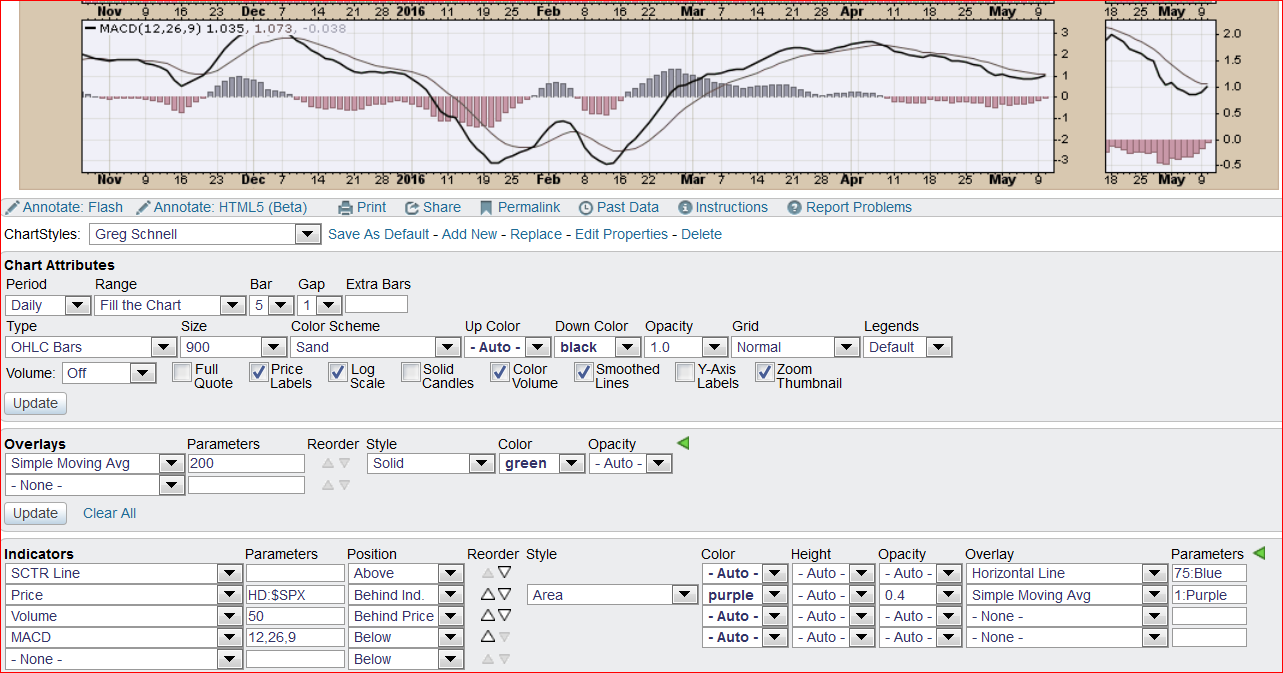
Let us know if it works, Gord
0 -
The method Mark described works fine to color the chart below the price line on a regular stock chart but what I am trying to do is to color a separate indicator window below the price line. e.g. the RSI price in its own panel.
Thanks.0 -
OK. I don't think you can do that with all indicators, only the ones that offer a drop down (with the "Area" option included) in the Style column (I think only the Price indicator variations offer it).0
-
Looks like this example is the only one I can find which happens to be a SCTR chart having a solid color below the price line from Gregg Shnell: http://stockcharts.com/h-sc/ui?=HD&id=p8&def=N&listNum=1
I don't know how he did this but will check for an other example which may show the inputs.
Thanks for your info above.
0 -
The settings (inputs) for the Schnell chart for HD are identical to the ones for Gord's example above. If you look at the first illustration in Gord's answer, you will see two little green triangles with gold dots and the legend "Advanced Options". You have to click on the lower green triangle to see the options that Greg used (Gord's second illustration).
SCTR Line is first, and under advanced options he added a blue horizontal line at 75 on the vertical axis (that setting is way over to the right under Parameters).
Price (for HD:$SPX) is the second indicator. In the Position column, he put it behind the SCTR Line by selecting "Behind Ind." from the drop down, so both appear in the same window above the chart.
He got the color under price by selecting "Area" in the Style column and then choosing purple for a color. He got the "bold" line that borders the shaded area by using a one period simple moving average and choosing purple for the color (again, see way to the right under Parameters he has "1:purple" next to "Simple Moving Average" in the Indicator column.
0 -
Markd, great explanation of all the components of the chart.
Simcoe, yes it's not a one click answer, its a series of settings that Gregg Schnell used to create his chart. But these are all settings available to Extra level users, so just follow his settings.0 -
Simcoe, do you watch "Turn" on Netflix? Good show. One character, Simcoe, is quite the shrewd one.0


Categories
- All Categories
- 2.4K StockCharts
- 397 SharpCharts
- 146 Other Charting Tools
- 69 Saved Charts and ChartLists
- 1.5K Scanning
- 74 Data Issues
- 177 Other StockCharts Questions
- 218 Technical Analysis
- 155 Using Technical Analysis
- 2 InterMarket and International
- 19 Market and Breadth Indicators
- 42 Market Analysis
- 109 Trading
- 109 Trading Strategies
- 163 S.C.A.N the StockCharts Answer Network forum
- 65 Using this StockCharts Answer Network forum
- 98 s.c.a.n. archives
- 5 Off-Topic
- 6 The Cogitation & Rumination Emporium
- Forum Test Area