New Members: Be sure to confirm your email address by clicking on the link that was sent to your email inbox. You will not be able to post messages until you click that link.
I think I finally found a good scanning solution for tracking bearish/bullish swings

in Scanning
Hello, all. I've been using Stockcharts for 4-ish years, learning as I went. One thing I tried to do for a while was set up scripts that would tell me when green ADX swung above red ADX, or when there was a bullish Tenkansen/Kijunsen cross in Ichimoku, meaning a likely positive setup. For whatever reason, all my scans would return signals that were 5-10 days old, leading to frustration.
Recently I tried scanning for SAR bullish/bearish dot crosses, and this finally seems to be what I was looking for: an easy to way to track when items in my main chartlist are possibly setting up for a run up.
My scans looks like this is anyone is interested. It basically flags a cross that happened today or yesterday.
// Scenario 1: Cross happened TODAY (between yesterday's close and today's close/current)
[[ChartList is 21] AND
[close < Parabolic SAR(0.02,0.2)] and
[yesterday close > yesterday Parabolic SAR(0.02,0.2)]]
or
[[ChartList is 21] AND
[yesterday's close < Parabolic SAR(0.02,0.2)] and
[2 days ago close > yesterday Parabolic SAR(0.02,0.2)]]
0
Comments
-
Parabolic SAR is a great indicator. You can change the parameters to further study and refine to match up with "style". In the 1st edition of the Encyclopedia of Technical Market Indicators, published in 1988, the authors suggested that the PSAR had one of the more favorable outcomes in their backtests. I think that they compared outcomes vs a simple MA crossover. I don't have the 2nd edition, published in 2002, to see if that observation was still true in the updated backtests, but I suspect it is.
https://www.amazon.com/Encyclopedia-Technical-Market-Indicators-Second/dp/0070120579
I use PSAR on all my saved chartstyles. In my opinion, It does a great job of displaying the trending and non-trending and change of trending environments. It's a very flexible indicator.
It's available in a Predefined Scan as well.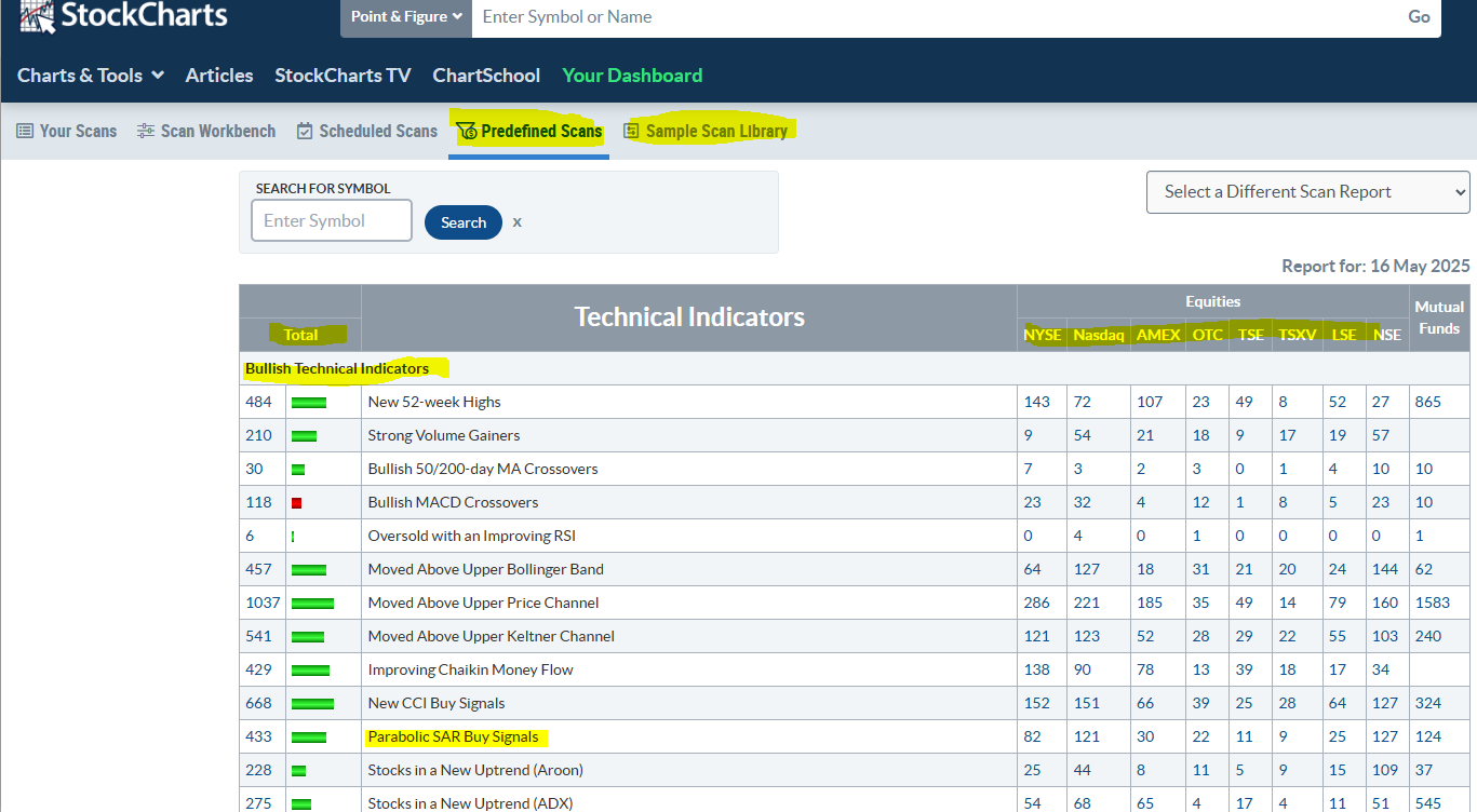
Predefined Scans can be accessed through the link in Charts&Tools. It's also showing in the links across the top of the Advanace Scan Workbench. The Predefined Scans have several sections for Bullish and Bearish changes. They show the number of Total Symbols (excluding Mutual Funds) that meet the daily threshold. If the Total is more than the prior day's Total, it shows a green bar and if less a red bar. The longer the bar the larger the percentage change from the prior period The Total is broken down further by Exchanges.
The Predefined Scans and the Sample Scan Library are quite useful links to use.
If you click on the number it will open a listing of the symbols that meet that default scan requirements. You have several options of what you can do with the results.
It will open in Summary view. Hover over a Symbol to see a thumbnail chart. Clicking over to SharpCharts or CandleGlance will display the listing using the StockCharts.com default Sharpchart and CandleGlance styles.
You can also Save the results to your own chartlist, Download the results in a CSV, or Edit the Scan Criteria to further refine the results.
I used the Edit the Scan Criteria to develop my scanning writing "skills" when I first started wanting to write my own scans. I furthered my "skills" using this forum for help, either using the Search box at the top of the forum or asking questions and getting assistance from other users here If you Edit a Scan you can then Save it to YOUR own listing of Scans in your account to use in the Advanced Scan Workbench. It will be listed in the Your Scans link at the top of the page.0 -
Thanks Imkwin ....What SAR settings do you use? The standard one? The thing I don't like about SAR is it typically shows a really nice smooth flow, then suddenly in the middle of that, it shows a short flip whipsaw before reverting again. Any suggestions to fix? ... these flips and revertings are annoying, so you cannot just take every signal without confirming. Story of my life.0
-
Nice commentary, thanks. I wish I knew why Stockcharts was so bad at any scan trying to check for ADX green/red crosses, or Tenkansen/Kijunsen (Transfer/Baseline) crosses. No amount of testing could make signals that had fired within 2 days only, and it would always give signals from 7+ days ago.0
-
Thanks Imkwin ....What SAR settings do you use? The standard one? The thing I don't like about SAR is it typically shows a really nice smooth flow, then suddenly in the middle of that, it shows a short flip whipsaw before reverting again. Any suggestions to fix? ... these flips and revertings are annoying, so you cannot just take every signal without confirming. Story of my life.0
-
@azb, I currently have a parameter of 0.01,0.04 on the daily chartstyle and 0.1,0.075 on the weekly. On my price charts I have Price Channels/Chandelier Exits, PSAR, ZigZag, and an on again, off again, relationship with Moving Average Envelope.
I put "Price Channels/Chandelier Exits" on this list as you can get your Chandelier Exit (CE) to mimic the Price Channel with a bit of flexibility if desired. CE is based on ATR, so you can offset the channel to be an ATR value tighter than the Price Channel (PC) if so desired. I find the value of the PC/CE is tremendous in helping see consolidation. Flat spot on the channel indicate pullbacks in the prevailing trend. So in a down trend, a flat spot in the lower channel indicates the price has moved away from making new lower lows. Same with the Upper Line in an Uptrend. It rises with new highs and then flattens with a pullback. You may "see" Darvas Box" patterns if you are into those via the use of PC/CE.
I agree that whipsaws on any indicator and price action can be very frustrating. SAR is designed to follow the price trend. When the trend is stronger it follows along, just like moving averages. When the trend weakens, the SAR and the moving averages catch up and move closer to the price. When whipsaws occur they can indicate a consolidation Stage or trendless environment. When these trendless environments occur is often a good time to be studying for potential actions. PSAR is just like any other indicator. You can take the "signal" as a call for action. Many times it will work out, until it doesn't. I don't use indicators to tell me what to do. I use them to help in my analysis of what to expect.
They are just indications on a chart to me. I just like the visuals of it. In reality, the more indicators on a chart the more confusing it can be. I do like PSAR as it appears on the Price Panel of the chart. It's fun to use in scans and/or alerts. But since all indicators are usually based on price action, it just personal preference as to what you "like" and does it help in your analysis and system.0 -
@peterinjapan What's your scan code for " I wish I knew why Stockcharts was so bad at any scan trying to check for ADX green/red crosses" that's giving the bad results?0
-
Your PSAR settings are great.
Now I like showing BOTH of these PSAR's on the daily price chart.
.02 .2 gold .4 and also .01 .04 orange .4 This gives me an early warning signal of changes.
IMKWIN -
What settings do you recommend for the price channels and Chandelier Exit.?
0 -
See attached chart
0 -
@azb , one thing that you may note is that the price interaction with the PSAR is similar to the interaction with the MA lines showing on your chart. I mentioned having an on again off again relationship with the moving average envelope, and this is why. PSAR often shows similar to the MA so I can lose the MA, if I desire to, and really not lose anything other than clutter.
On PriceChannels / Chandelier Exits I recommend having a setting that is meaningful to you on the chartstyle period. The indicator is just displaying the Highs and Lows of the period you choose. If you are using a daily chart and breaking above or below a 5 day (one week) high or low is important, or 20 day (4 weeks) high or low is important to your analysis of the chart, that's the one to use. I'd just suggest using one that is short enough to be responsive to the price action without being too responsive. The more "signals" created is not necessarily a good thing, especially if you aren't using them for analysis or actions.
I show Gerald Appel's "magic numbers" on my charts for my "horizontal indicator". I use the PC/CE to augment trend analysis and show flat spots in the price action. Flat spots in the channel lines indicate pull backs. Trend analysis is higher or lower highs and lows.
I have a 20 on my daily chart and a 10 on my weekly chart at the moment. The parameter for the Chandelier Exit would be 10,0.0 and 10,0.0,short to approximate a 10 week Price Channel setting. The nice thing about the Chandelier exit is that you can move the line to be X period ATR's away from the 0.0 line. The default on the CE is 22,3.0 . This puts a line at 3 ATR22 below the high for the 22 period. The same would be true for the comma short indicator, except the short places the line off the low for the period
0 -
Thanks. Nice explanation. I agree that PSAR acts like a moving average, see my chart above.0
-
If you are short term trading, and find indicators frustrating, here is an outline of a bar-by-bar method to consider.
Plot two MAs - one for highs, one for lows.
In a longer term up trend (above say, MA 20 or 50 rising) and after a short term down trend, look for a close above a falling MA of highs. Buy below the MA of highs, with a stop below the down leg low. Sell on a low or close below the rising MA of lows, or trail a stop below the rising lows.
In a longer term down trend, after a close below the rising MA of lows (so, after an up leg), short above the MA of lows and cover on a close above the MA of highs or trail a stop above the falling highs.
The length of the MAs needs to be determined for each symbol. In this example, the MAs are 5. The example is cherry picked for clarity - longer down legs in a down trend and more or less regular price action. Red arrows are entries, black arrows are subsequent exits. The wins and losses are approximate.
Note: there are long trades available on this chart, too (not shown, in November, December, February, March and April - up closes above MA of highs), but they are against the trend.
0 -
The nice thing about SMA and EMA's is that you can specify Open, High, Low, or Close (the default) for the MA. You can't on the Price Channels. The Price Channel will show based on the High and Low price point for the PC period specified. You can SHOW a PC based on close if you use a line (solid or dashed), histogram, dots, or area chart Type.
You can see the difference between the PC values change if using a chart type based on close prices. The below charts are High/Low then Close then High/Low then Close chart types.
As most use a OHLC type of chart, as do I, this is why I like the Chandelier Exit option for "price channel" as you can move the CE away from the High and Low just by adding the offset. I use a 13,0.2 on my weekly chart to move the line a quarter ATR13 from the High and Low. This often moves the lines closer to the Close High and Close Low while keeping the "channel" type of appearance on the chart.
A caveat is that you don't have Chandelier Exit as an option on the Indicator Overlays. Price Channels are. I am a fan of the Chandelier Exit for the same reason I prefer the Full Stochastic over the Fast and the Slow Stochastic. It provides a bit of flexibility to the user. You can make a Chandelier Exit behave link a Price Channel. You can make the Full Stochastic behave like a Fast or Slow Stochastic, or you can create a modified version that suits your eye and/or your needs.
@markd good use of the MA options. It also looks like the MACD crosses might have provided a good return on that chart. I don't know if the return would be better, worse or the same as the MA close crosses though.
0 -
@lmkwin
I noticed the MACD signals, too. They are fairly close by. But, the thing to keep in mind with MACD (as with other indicators) is that your entry and exit is, at the earliest, the open of the NEXT bar after the signal bar - NOT the signal bar itself (unless you want to anticipate the signal and enter somewhere during the signal bar, but that has its problems, too).
Sometimes that delay will work for you, but anecdotally, it seems to more often work against you, especially on exits (or maybe it just seems that way because you are giving up gains).
The 'bar by bar' method has the advantage of giving signals usually a couple of bars earlier, although, as the illustration suggests, it doesn't entirely eliminate whipsaws or drawdowns of gains before the exit either.
Overall, the best solution is finding stocks that trend well. Almost anything works if the trends are regular and persistent.0 -
Hi Peter
I am a Wyckoff trader also use RRG to find suitable stocks. Your scan seems to bring up good potentials on quick dirty review to further limit the numbers. Will feed back on findings.
Many thanks
Paul0


Categories
- All Categories
- 2.3K StockCharts
- 395 SharpCharts
- 146 Other Charting Tools
- 69 Saved Charts and ChartLists
- 1.5K Scanning
- 74 Data Issues
- 177 Other StockCharts Questions
- 218 Technical Analysis
- 155 Using Technical Analysis
- 2 InterMarket and International
- 19 Market and Breadth Indicators
- 42 Market Analysis
- 109 Trading
- 109 Trading Strategies
- 163 S.C.A.N the StockCharts Answer Network forum
- 65 Using this StockCharts Answer Network forum
- 98 s.c.a.n. archives
- 5 Off-Topic
- 6 The Cogitation & Rumination Emporium
- Forum Test Area